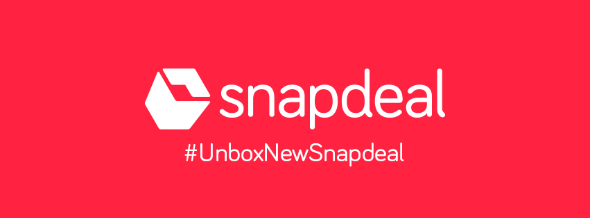
Snapdeal’s users woke up on Saturday morning with their brand having had an overnight makeover. Snapdeal has officially unveiled its new brand colours and logo (though there had been leaks starting Thursday), and it now sits proudly on Snapdeal’s site and social media pages.

The logo has also made its way into the real world, and can be seen on Snapdeal’s NCR office.
The logo’s redesign had been in the works for a while, and was being spearheaded by cofounder Rohit Bansal, who had worked with advertising agency McCann Erickson.
CEO Kunal Bahl had sought to drum up interest for the logo with a series of cryptic tweets leading up to its launch.
Something big and shiny coming soon… #excited
— Kunal Bahl (@1kunalbahl) September 8, 2016
The logo itself is a pretty significant change from its older version. Snapdeal now has a solid red background color, and logo elements are rendered in white. The blue from the previous logo has been discarded. The font is sleeker and slimmer, and looks a lot more modern.
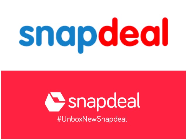
The most important addition, though, is the brand motif. It’s a tilted box with a square opening, and is cleverly composed of two opposite-facing arrows. The arrows are solid and in 2D, but create a pleasing and effortless 3D effect. The box also ties in with Snapdeal’s new tagline, #UnboxNewSnapdeal.
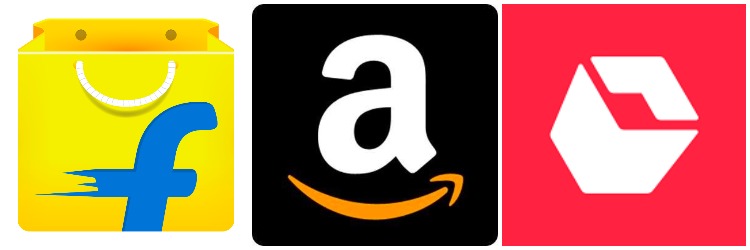
The box logo is designed to be used when space constraints dictate that the entire logo can’t be used, for instance on Facebook and Twitter profile pictures. Interestingly, the motif doesn’t carry a Snapdeal identifier. Flipkart’s square logo carries Flipkart’s F; Amazon’s has the A. Snapdeal’s new box has no obvious signs it belongs to Snapdeal.
It’s a bold move to divorce your brand’s identity from its motif, but in Snapdeal’s case it seems to work. The red is similar enough to Snapdeal’s old shade of red, and is yet distinctive; the box is something that’s ubiquitous across deliveries in the e-commerce space; and the logo with its clean lines and modern design looks pretty memorable.
Logo changes for popular brands are risky business, but Snapdeal might’ve just pulled this one off.