As Uber moves from being a brash young startup to a company that’s preparing for an IPO, it’s giving itself a bit of a makeover.
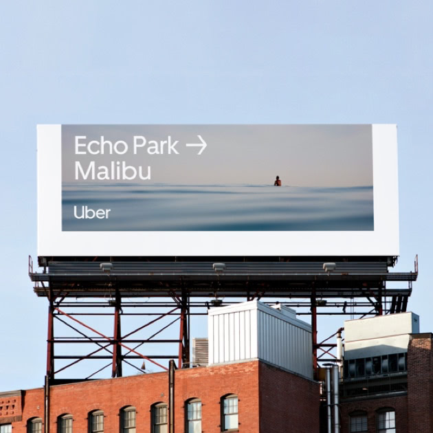
Uber’s changed its logo and design in a major new rebranding exercise. The old logo with the square in the middle of a circle is out, and has been replaced with simple text that says “Uber”. The text is written in a font that’s custom-designed for Uber, and there’s some hidden imagery thrown in as well — the line between the U and the b looks like a road, and as the app zooms into it as it opens.
Uber’s new look might look clean and sophisticated, but Uber says it was necessitated by practical concerns. Uber says that its current logo, which was a symbol chosen two years ago under former CEO Travis Kalanick, wasn’t creating good enough recall with customers. “As we expand our reach into our other markets and modalities, it’s super important that it’s very clear that when you’re getting into an Uber car or on an Uber scooter, you know that is an Uber product,”said Peter Markatos, Uber’s executive director of brand. “We weren’t achieving that with our current system. It doesn’t make sense to build more equity into something that people don’t understand.”
![]()
The previous logo, which had been unveiled in February 2016, was supposed to convey a deeper meaning about Uber’s mission. The square supposedly represented a “bit,” while the circle depicted an “atom” — two things that the company prided itself in bringing together. The “bit” was the technology that Uber used, while the atoms were the physical space it operated in. “The unique aspect of Uber is that we exist in the physical world,” Travis Kalanick had then said. “We exist in the place where bits and atoms come together. That is Uber,” he’d added.
The logo’s highfalutin explanation doesn’t seem to have gone down well with the current management, and Uber’s reverted to a more traditional logo which bears its name. The colour scheme is a sedate black and white, and Uber says its chief design symbol will be a forward-facing arrow, which will be used in a variety of situations. The custom-made font, called Uber Move, is inspired by fonts used in iconic transportation systems around the world.
The rebranding might look aesthetically pleasing — the previous logo had been met with some disapproval when it was launched, with some snide remarks saying that it looked like SBI’s logo turned sideways — but it also represents the fast-changing forces at Uber. The old logo was perhaps the most visible symbol of Travis Kalanick’s legacy — he often talked about the whole bits-atoms idea in interviews, and was in charge of Uber when it was commissioned. But the later part of his tenure had been beset with controversy, with Uber being accused of everything from systemic sexual harassment to evading law-enforcement agencies. Dara Khosrowshahi had stepped in as CEO in August last year, and has since looked to take Uber on a new path, one that he’s said will likely end up with an IPO. Uber is preparing for the move by not only getting itself a new brand identity, but by very visibly letting go of its Silicon Valley, vaguely libertarian, and very geeky bits-and-atoms past.