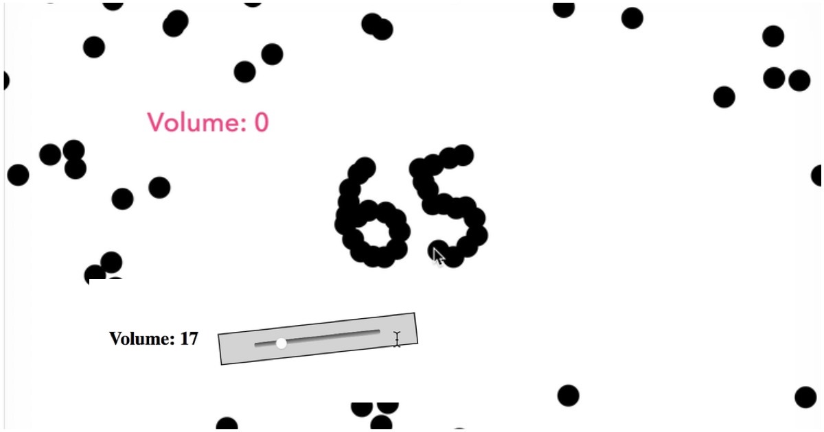
The humble volume slider isn’t something that UI and UX designers usually obsess over. It’s a fairly standardized UI element, and everyone knows how to use it — you slide the button to the right to increase the volume, and to the left to decrease it. But earlier this week, a strange meme began on reddit. People began designing the worst possible volume sliders they could think of.
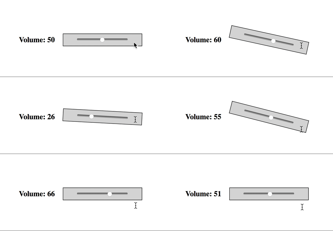
The first few iterations had some subtle changes. This volume control moved sideways instead of up and down. Annoying, but still nothing users couldn’t handle.

But things moved fast very quickly. This one took the slider bit a little too seriously.
While others turned it into a little game — you can projectile shoot your volume controller into place by holding on to the button.

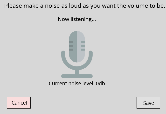
Then things got creative. Why have a pure haptic input, when you could speak?
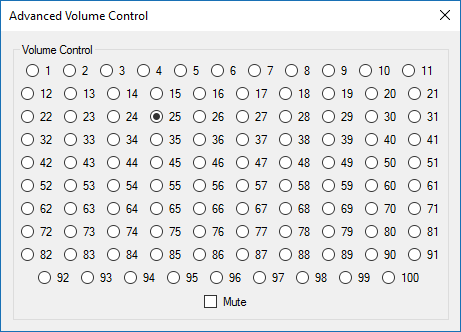
This one wasn’t pretty, but gets the job done. Amongst this maze of radio buttons, there’s even a handy mute option.
This one utilizes image processing, machine learning and pattern recognition, all to create what could be the most infuriating volume control of all time.
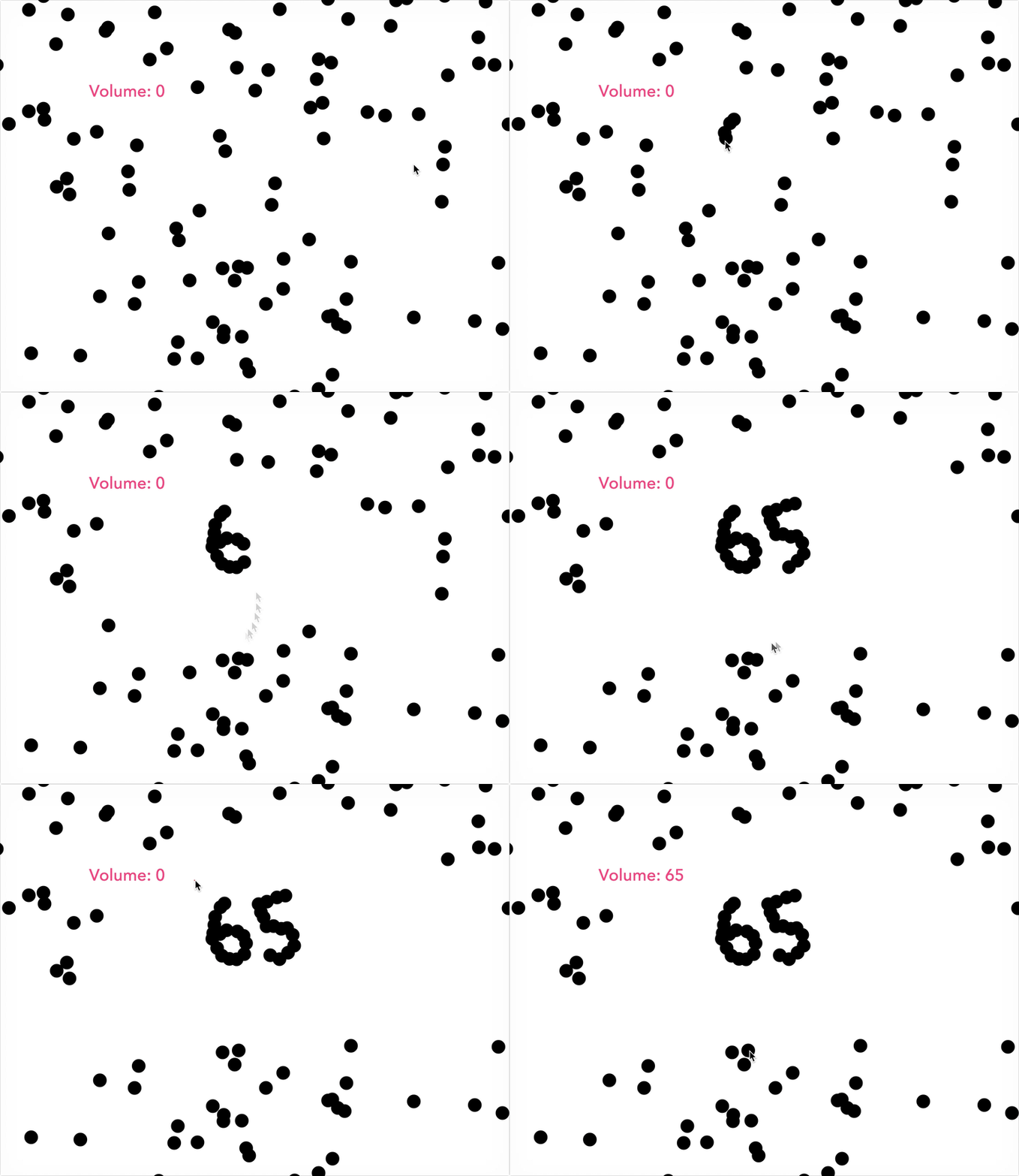
This one transforms the act of changing volume into a challenging little game — one you might or might not have stomach for as you’re catching up on your favourite shows.
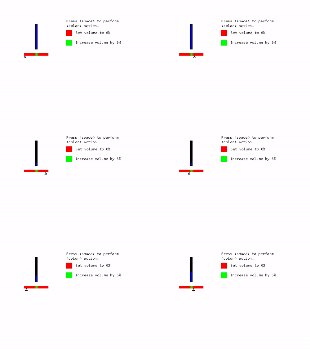
And finally, volume control might be a little too deterministic — why not make it a gamble, much like the rest of life?
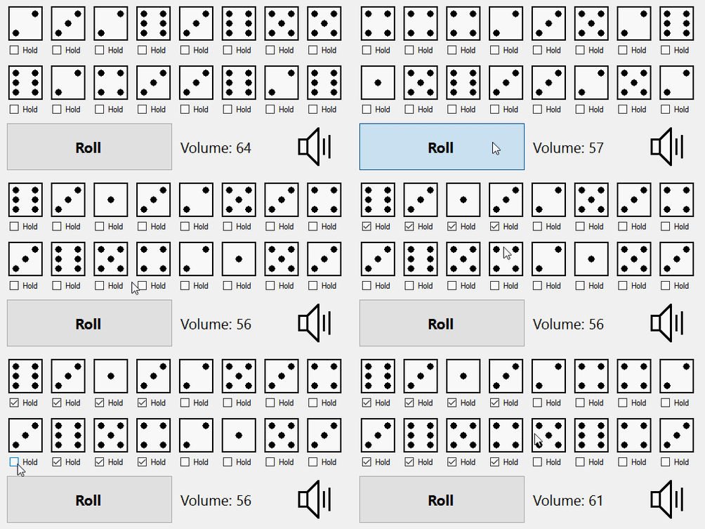
The next time you change the volume on your YouTube videos, remember to be grateful for the little volume slider. Left to themselves, UI designers can go amuck.
