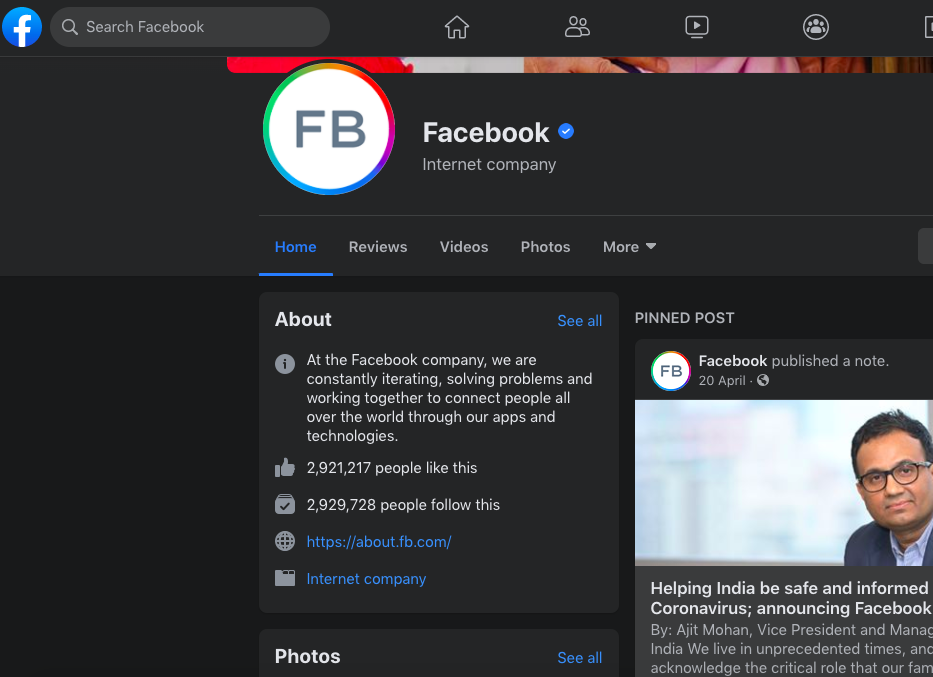
Facebook has unveiled a new web layout for its platform just as June has rolled in. The redesign is part of the larger rebranding campaign of the social media giant early last year which purported to reflect its redirection towards “privacy focussed communications”. Even though the new look was available to a few users as early as April this year, it’s now been rolled out to a larger base in what is probably a staggered rollout.
The company had announced the change on Twitter on May 8th.
We’re starting to roll out the fresh, simpler https://t.co/iDOncH15cd. It’s faster, easier to use, and gives your eyes a break with dark mode. pic.twitter.com/dFRxaeTMcd
— Facebook app (@facebookapp) May 8, 2020
The new layout comes with changes such as bigger CTA buttons, and a two-column page as opposed to a 3-column page.
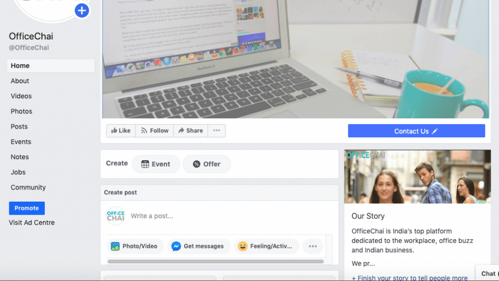
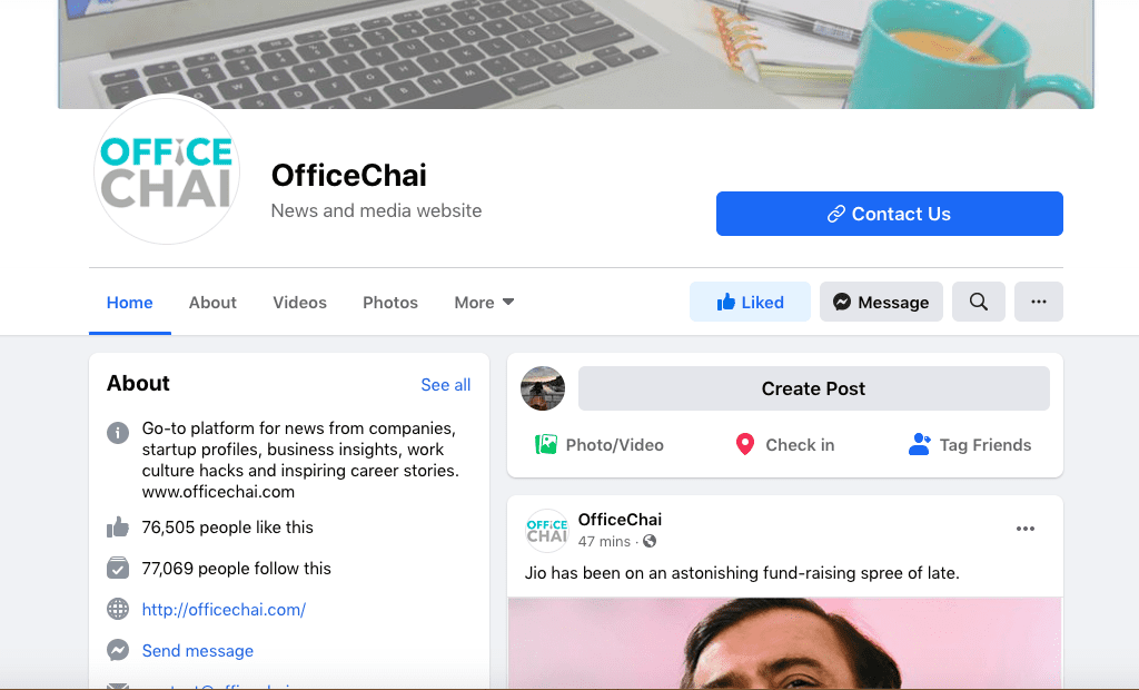
The top bar has become less text-heavy and more icon-dominant. The blue bar is gone and replaced with a white one.


Quick-link icons on the left sidebar have become more prominent and colourful. Subcategories like “explore”, “shortcuts” have been done away with. The new layout is headlined with a prominent “Covid-19 Information Centre” link on top.
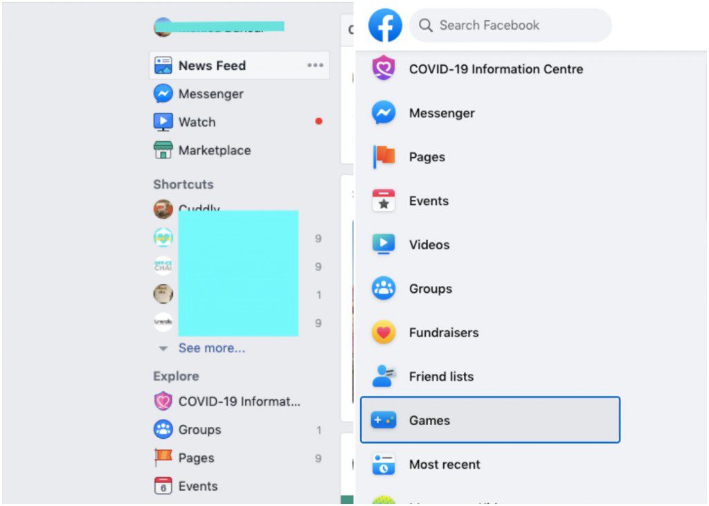
There is an option to “switch to classic Facebook’. Much like Twitter did a few months ago, an option to switch to the “Dark Mode” has also been introduced.
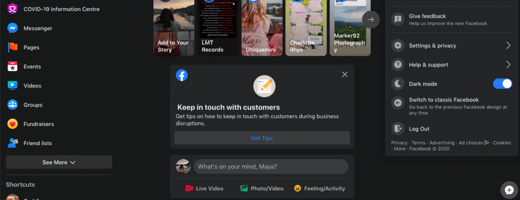
“Facebook realized that select features were still popular on the web and should, therefore, be prioritized. The inverse was also true. Lots of pixels on the homepage were being taken up by features that don’t get a lot of usage at all. Similarly, the areas that had become important — or that Facebook expected to become pillars of the desktop experience — were buried because they didn’t fit into a design structure established years ago” Tom Occhino, director of engineering for the Facebook app, told Engadget.
In November last year, Facebook had changed its iconic all Blue logo into a minimalistic colourful one to reflect its position as not just as a social media platform, but as the collective group including the Facebook app, Whatsapp, Instagram and its many other properties. “The new company branding is designed to help us better represent the diversity of products we build, establish distinction from the Facebook app and communicate our purpose in the world.”, the company had said in a statement.
Facebook @facebook rebranded there logo last week for new bolder look. pic.twitter.com/TJkyYtkpwt
— Karthik Konaar (@karthikkonaar95) November 13, 2019
While Facebook has continued to tweak its mobile app every now and then, the desktop version had more or less remained the same over the years which affected its design and performance over time. “The site became pretty slow and cluttered from a user-experience perspective,” Occhino said. “The technology stack that supported it didn’t receive a lot of love, and a lot of the updates and modernization that we were seeing in the mobile technology stacks.”
With a massive redesign effort focussed on its web interface – when majority of the users browse it on mobile – reinstates Facebook’s commitment to be inclusive in its approach towards all users. Even the few that still prefer to use Facebook on their desktop, or divide their time between the app and the desktop versions.
Facebook’s desktop app is where it all started for the media behemoth, and with the web redesign, its legacy might just live on a lot longer.
