Fiverr‘s pitch is short: hire a freelancer in minutes, find professionals for any project. The mobile app exists so you can manage that hiring from anywhere. But a lot of the actual work of running a business happens at a desk, with a browser full of tabs and a proposal document half-finished.
That’s the gap this piece looks at. What the Fiverr app feels like when it’s running in a window on Windows, what it does well there, and where the mobile origins show.

First screen
Open the app and you land on a search-first home view. There’s a search bar at the top, category tiles below it, and a scrolling feed of recommended sellers and gigs underneath that.
The category structure is the backbone of the whole thing. Fiverr lists thousands of freelancers across 116 service categories, and the app surfaces them as browsable tiles rather than a dropdown menu. Digital marketing sits near the top, and the rest of the tree fans out from there into writing, design, video, programming, and business services.
On a desktop screen the layout stretches rather than reflows. You get a tall, narrow column of content with margins on either side, which looks a little odd at first but turns out to be fine once you’re reading gig cards. Scrolling with a mouse wheel is smooth.
Search behaviour
Typing into the search bar brings up suggestions fast. Where it gets useful is the filter panel after you run a query: delivery time, seller level, budget range, and language all narrow things down without reloading the whole list.
Having a real keyboard here matters more than you’d expect. Refining a search from “logo design” to “minimalist logo design for SaaS startup” takes three seconds on a physical keyboard and considerably longer on a phone.
Gig pages
A gig page is where you make the hiring decision, and it’s dense. You get the seller’s package tiers, what’s included in each, the delivery window, revision count, and the reviews below.
The package comparison is the part that benefits most from screen space. On a phone you swipe between Basic, Standard, and Premium. In a larger window you can see more of the detail at once, which makes it easier to spot that the mid tier includes source files and the cheap one doesn’t.
Reviews load in a paginated stack. They’re readable, though the app doesn’t give you much in the way of sorting beyond the default ordering.
Messaging and briefs
The inbox is the workhorse. Every pre-purchase question, every clarification, every file handoff runs through it, and this is the single strongest argument for having Fiverr open on a desktop rather than a phone.
Attachments are the reason. When a designer asks for your brand assets or a developer wants the spec document, those files are almost always sitting in a folder on your PC. Being able to pull them straight from File Explorer instead of emailing them to yourself first removes an annoying extra step.
Typing long briefs is the other reason. A proper project brief runs several paragraphs, and thumb-typing that on a phone is where a lot of half-finished requests come from.
Fiverr for PC setup
Fiverr publishes a mobile app, so getting it onto Windows means running an Android environment on the desktop. An emulator creates that environment and the app installs inside it, behaving much as it would on a tablet.
BlueStacks is the one most people reach for, largely because its installer handles the setup with minimal fuss. Alternatively, LDPlayer runs lighter on modest hardware and gives you a similar result.
The general flow looks like this:
- Install the emulator on your Windows machine and let it finish its first-run configuration.
- Sign in to a Google account inside the emulator so the Play Store works.
- Search the store for Fiverr and install it as you would on a phone.
- Launch it, log in to your Fiverr account, and your existing orders and messages sync across.
Once it’s running, the emulator maps your mouse to taps and your keyboard to the on-screen input. Guides such as this Fiverr app download for PC walkthrough cover the emulator side in more detail if the first launch throws up something unexpected.
Virtualization support in your BIOS makes a noticeable difference to how responsive the whole thing feels. Check that setting before blaming the app for sluggishness.
What feels clunky
Not everything translates. A few things stand out after using it this way for a while:
- Notifications fire inside the emulator window, so if that window is minimized behind your browser you’ll miss them.
- Some gig media, particularly video previews, plays at mobile resolution and looks soft on a large monitor.
- Copying text between the emulator and Windows works, but clipboard sharing occasionally needs the emulator’s own paste button rather than a plain Ctrl+V.
None of these break the experience. They’re friction, and they’re the kind of friction you stop noticing after a week.
Who leans on it
The store description names the audience directly: business owners working around the clock, people rushing to finish projects, entrepreneurs on the move. That maps neatly onto how the app gets used at a desk.
A startup founder outsourcing a landing page, an agency subcontracting overflow copywriting, a solo consultant who needs a pitch deck by Thursday. The common thread is someone who doesn’t have the headcount to do it in-house and doesn’t want the overhead of a formal hire.
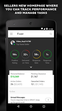
For freelancers on the selling side, the app carries the same account. Order management, buyer messages, and delivery uploads all work from the same interface, and uploading a finished deliverable from your Windows folders is far quicker than routing it through a phone.
Which loops back to that package comparison screen. Seeing all three tiers side by side, on a monitor, with the source-files line clearly visible, is the difference between hiring the right gig and paying for a revision round you didn’t need.